A Careful Refresh of Mole's Icons
I want to share a few thoughts on upgrading the icons in a product: what to watch out for and where there is room to improve.
This morning I gave Mole's icons a careful upgrade. Until now it used the system icons, which I think are perfectly fine for a simple product, but look closely and something is missing: a bit of character.

Choosing an icon library
After looking around, the two libraries that suit app icons best are Remix Icon and Phosphor Icons. I used Remix a lot when building for the web, and it is simple and comfortable, but in an app it did not look right to me, so I switched to Phosphor, which has real character and looks great. About 70% of its icons could be used as they are, and the other 30% I drew myself by having Opus 5.5 write the SVG, so the whole set stays consistent.
Always judge them inside the product
The comparison above probably does not show much difference at first glance. More often than not you have to put the icons into the real product, and I also consider how a whole group of icons in one module works together. Sometimes every icon looks good on its own and the group still looks wrong, the way a face can have features that are each fine yet do not sit well together. So my advice is simple: when you replace icons, look at them in the actual product, all together, and that is where they come out right.
Small ideas give a product life
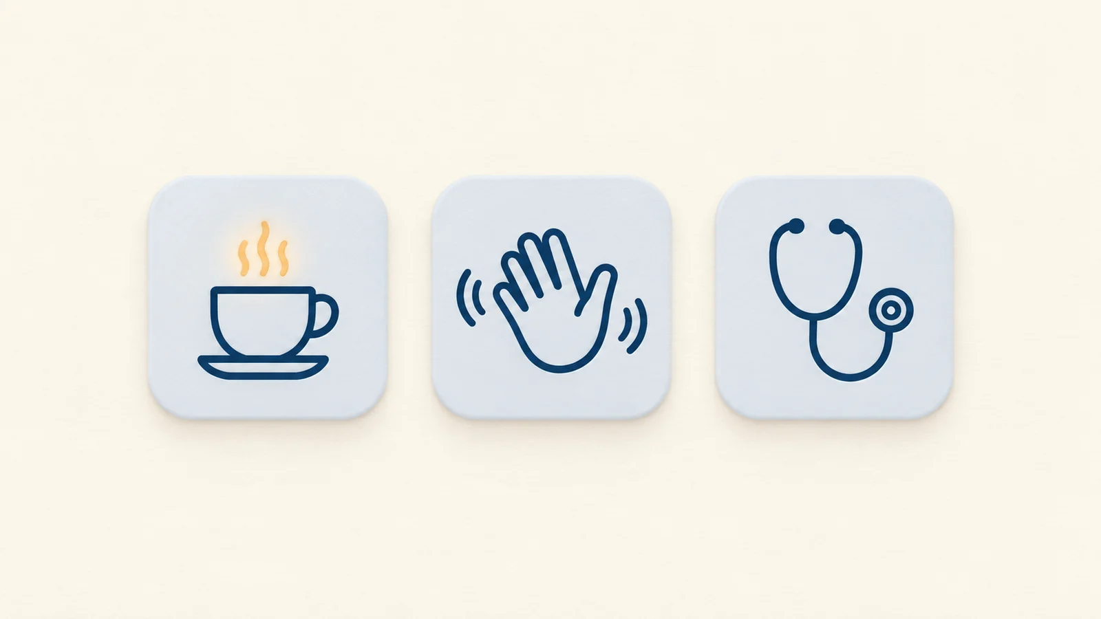
Second, I keep coming back to the idea that the products we make should have some spirit, a sense of being alive, rather than the cold output of AI coding with none of your own thinking in it. Small details such as icons are a good place to add that life. For Keep Screen On I used a cup of coffee, the Caffeine metaphor: your Mac has had a coffee and cannot fall asleep. About usually gets a circled i, but I thought of it as a hello, so it is a waving hand. Doctor would normally get some kind of troubleshooting symbol, and here it is a stethoscope, more like a doctor giving your problem a check-up. There is room for many small ideas like these in a product, and together they make it a lot more fun.
Alignment, size and centering
Finally, good design almost always comes back to alignment, order and a well-judged rhythm. Making icons, text and the sections above and below look aligned, the same size and even vertically centered, as the eye actually sees them, means checking and adjusting them one by one. That includes aligning type with icons, and dealing with Chinese and Latin characters that do not share the same vertical center in the first place. You can spend a long time refining this, and I find it a lot of fun.
A few examples from this round. The battery started as an empty outline that looked the same at any charge, so a full battery read as empty; it now fills by quarters. The icons in the menus first followed the system icon size and looked too large and heavy there; 14.3pt came down to 12.5pt, still a little big, and settled at 11pt. Some icons were sized by their width and others by their longer side, so the tall broom and the sign-out arrow looked big while the wide bug and the line chart looked small. They are now sized by the average of width and height, with a cap on the longer side, and new icons follow the same rule automatically. And in the comparison image I made for a tweet, the word Mole in the title is set in a Chinese serif whose Latin letters sat 4pt higher than the Chinese next to them, so it had to be nudged down on its own before the two lined up.

Listening to users, then one more round
After the post went out, users started writing back. A few icons I was happy with looked off to them or felt unfamiliar: Check for Updates used a download icon and read as download, the small cube for GPU did not look like a graphics card, the archive icon made no sense, two stacked sticks did not quite say memory, and some people found the sponge for Clean Screen and the waving hand for About unattractive.
That is exactly when a short conversation with users beats being sure on your own, so each of these went through one more round following their suggestions. Check for Updates became a clockwise arrow, GPU a graphics card with two fans, the archive a storage box, and audio went from music notes to headphones. Clean Screen went back to the brush of the very first system icon, About returned to the plain circled i, redrawn to match the weight of the rest of the column, and memory went back to a chip. Several of them changed three times along the way.

Spend the time AI saves on polish
This kind of work can look pointless, but it is something I really enjoy. AI gives a big lift to good code and passable taste, and it can seem as if people have nothing left to do but talk. I think the opposite is true: the person matters more here. The time AI saves you is exactly the time to spend polishing the product, so that the 1% of users who notice get, every now and then, that feeling of getting it instantly, of "whoa", of a small magic trick. That is what makes it valuable and fun, and perhaps it is what I find most interesting about building independent products.