# Mole Windows, a Cleaner Can Look Good Too
Mole brings Clean, Apps, Optimize, Analyze and Status into one Windows window. Open Clean and start with the Earth and the next action. After scanning, inspect the list. Information appears as the task needs it, rather than presenting every button and parameter at once.
A Windows utility can look good, but its design also lives in everyday decisions: whether lists are readable, effects are visible before confirmation, a task is downloading or installing, and content stays together in a wider window. Those details belong alongside colors and icons.
## Evaluate a utility through three actions
Start with its scan list. Do the name, path and size describe the same row, or must you switch pages to learn what a button affects? Information hierarchy has a practical job: find the object first, understand the effect next, then inspect details. Hiding every path merely to produce a clean screenshot does not achieve that.
Next, watch a task waiting. A download can be cancelled while an installation has different constraints. One vague processing label can encourage repeated clicks. Percentage progress also requires a known total; displaying downloaded bytes when the total is unknown is more informative than inventing a slowly increasing percentage.
Finally, inspect confirmation. A button labelled Continue or OK requires rereading the body to know its effect. Naming the app to quit or the files to move, with cancellation preserving the current choice, supports the decision. Microsoft's [dialog guidance](https://learn.microsoft.com/en-us/windows/apps/design/controls/dialogs-and-flyouts/dialogs) similarly calls for action-specific responses and a safe way to dismiss a destructive question.
## Fewer controls should still leave enough information
Stable entry points and expandable details reduce searching. Removing paths, selection state and deletion methods instead pushes uncertainty onto the user. Cleanup tools particularly need to distinguish regenerating caches from personal files.
When viewing a screenshot, ask whether you can predict the next button's effect. Then try a small window, keyboard navigation and a denied permission request. Can you still understand the state? These questions work for other Windows utilities too. Colors and rounded corners contribute to design, but understandable decisions and verifiable results make it usable every day.
## Five pages with a familiar way to work
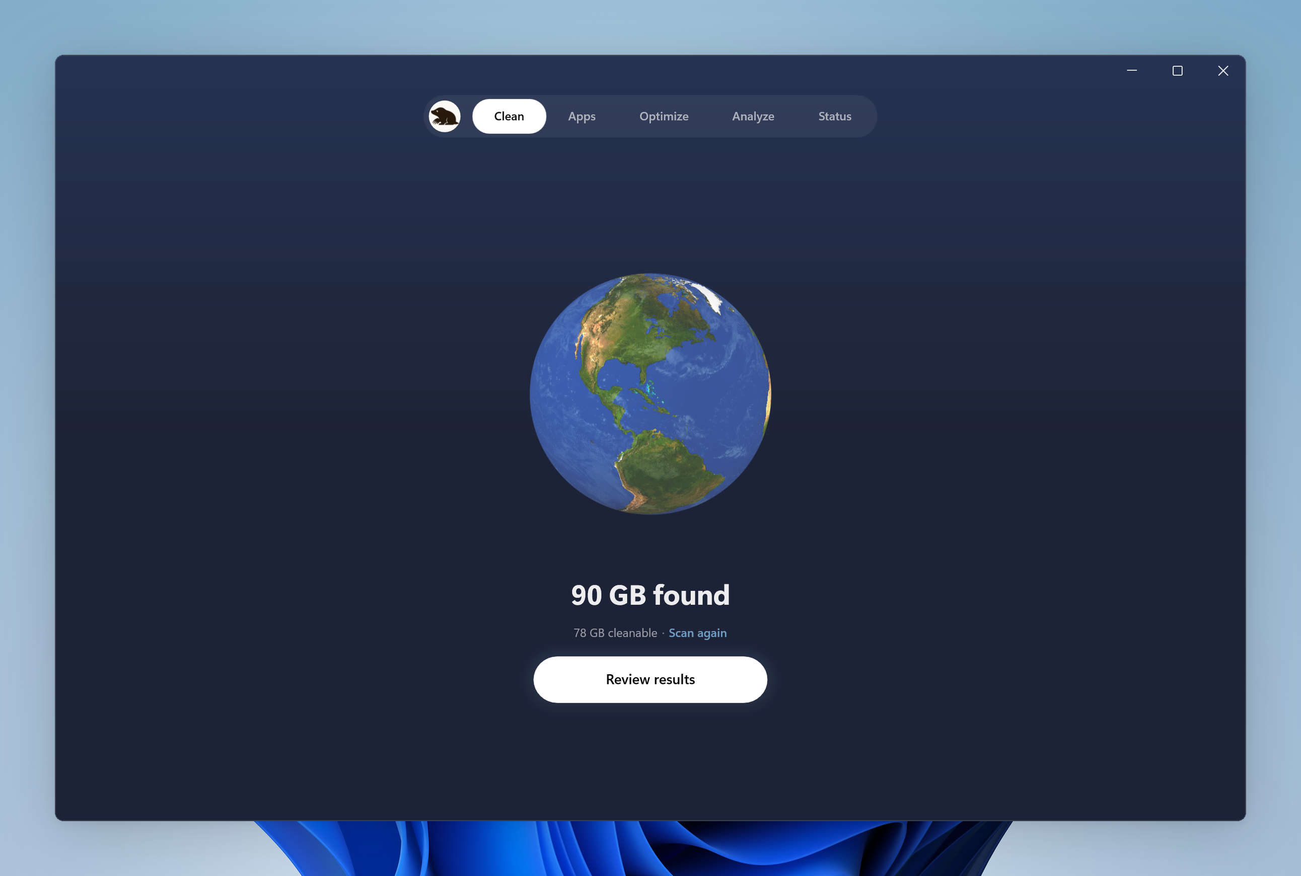
Earth, Mars, Mercury, Jupiter and the Sun distinguish Mole's five pages. Navigation and placement stay consistent when you switch tools. Mouse controls sit alongside `Ctrl + 1` through `Ctrl + 5` for selecting pages and `Ctrl + Tab` for moving to the next one.
Mole is a native Windows app built with WinUI 3. The window, taskbar and tray use Windows entry points, and the interface follows system display scaling. Mac and Windows share a visual language while implementing permissions, shortcuts, installation and file handling for their own systems.
Clean shows the scan state before opening the file review list.
## Good handling starts with understandable confirmation
Cleanup items, paths and sizes stay together. Regenerating caches have their default choices; offline downloads and personal data wait for the user's decision. Files in use name their owner. The selection and the next action belong to the same flow, without asking you to remember one page's total and guess what another page removes.
Apps uses a similar rhythm. Run the app's own uninstaller first, then handle selected leftovers. Files, registry registrations and personal data have their own review. An understandable confirmation is more useful for deciding than a more prominent cleanup button.
The [cache boundaries](/windows/blog/windows-cache-cleanup) and [uninstall leftovers guide](/windows/blog/what-apps-leave-after-uninstall) describe the same choices the interface presents.
## Waiting should show what the task is doing
App updates identify downloading, administrator approval and installation as separate stages. When a total download size is available, progress shows a percentage. Downloads can be cancelled; once installation starts, the installer gets to finish its steps. Supported browsers can update while open and use the newer version after their next restart.
Clean and Apps lists remain centered in a maximized window, keeping paths, sizes and actions near each other rather than spreading a row across the whole display. Confirming an app's exit also names the software being closed.
## Status and the tray keep everyday checks nearby
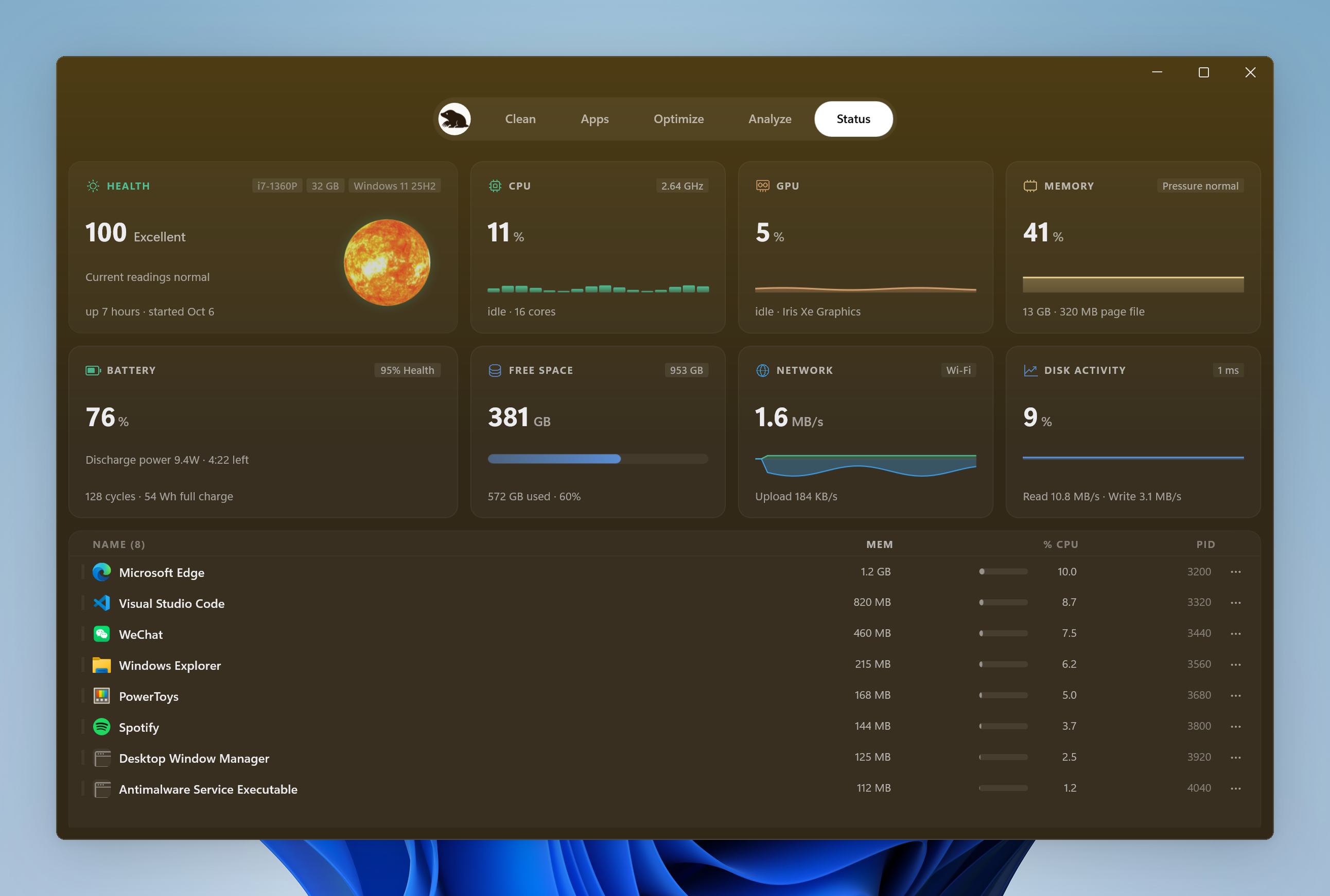
Status arranges CPU, GPU, memory, disk and network readings above the process list. Laptops have battery information. GPU and drive temperatures appear when the hardware provides readings. Search and process details are available for investigation without keeping every detail expanded at all times.
Status cards and the process list share typography, spacing and colors.
The tray keeps a smaller status panel with Keep Screen On and Clean Screen, so a temporary tool does not require finding the main window again. The [keep-awake guide](/windows/blog/keep-windows-awake) explains the control that shares this existing tray entry.
See the interface on the [Windows site](/windows), then try Mole on the PC you use. Images show its layout and colors. To judge the handling, review a cleanup list, switch pages and complete a task you actually need.
Canonical: https://mole.fit/windows/blog/mole-windows-design