# Making Mole's Menu Bar Numbers Fit In
> Why Mole's CPU and memory readings looked out of place in the menu bar, and the type, spacing and alignment details that fixed it.
Published: 2026-09-27 | Updated: 2026-10-01
Mole can show two numbers beside the little mole in the menu bar, CPU and memory by default. People have told me for a long time that it never quite sat right next to the icons around it, though nobody could say exactly why. This time I took a screenshot of my own menu bar and went through it item by item. The problem was not any single number. Type size, weight and spacing each looked acceptable on their own, and together they made Mole stand out from everything else on the bar.
The same menu bar, before on top and after below.
## Start with the neighbours
In my screenshot, the item to the left of Mole was Stats, an open-source menu bar monitor. I read the code it uses to draw the menu bar: its small cells put a 7pt light label over a 12pt regular value, its two-line network speed is 9pt, and there is no bold anywhere on the bar. Mole used two lines of 8pt semibold text. Measured on the same screenshot, Mole's text was 12 pixels tall while Stats' was 13 to 16, so Mole was a size smaller than its neighbours and the only bold text on the bar, which turned it into a small grey smudge.
I had tuned this several times before, going from 10pt to 9pt to 8pt, and every time I was looking at the mole on its own rather than next to other status items. So the text kept getting smaller while the weight never changed. The menu bar is shared space, and nobody reads one app's item in isolation, so this time I followed the style people already read every day: 7pt light labels, 12pt regular values, 9pt regular for the two-line layout and network speed, nothing bold, and hierarchy carried by size alone.
## Measure the ink, not the box
Once the type was settled, the spacing problems surfaced. The gap between the mole and the first number, the gap between two metrics and the gap between a label and its value were each computed their own way, so the item never read as a whole. The old code measured distances from image edges or text layout boxes, but the eye sees ink, and the blank space between a box and its ink differs from glyph to glyph. Two gaps both set to 3pt could look twice as different.
The mole showed this most clearly. Each character's sprite sheet carries its own transparent margin, so a fixed distance from the image edge left only 6.5pt beside the mole and more beside a different character. Now Mole finds the rightmost opaque pixel across every animation frame and measures from there, so whichever character you pick, the distance to the numbers is about 12pt.
The gap between two metrics had a similar trap. Each cell reserves room for its widest reading, 100% for percentages, so the menu bar does not shift when a reading goes from 9% to 44%, and with two-digit values that leaves roughly 13pt between cells. Once both cells reach 100%, though, the reserved slack disappears. One version during this work left only 3pt between cells, and at full load the two-line layout printed `100%999 KB/s` as a single run. Cells now keep at least 6pt apart, so they stay separate even at full load. Labels and values are 3.5pt apart vertically, the same as Stats.
## Left-aligned lines can still look misaligned
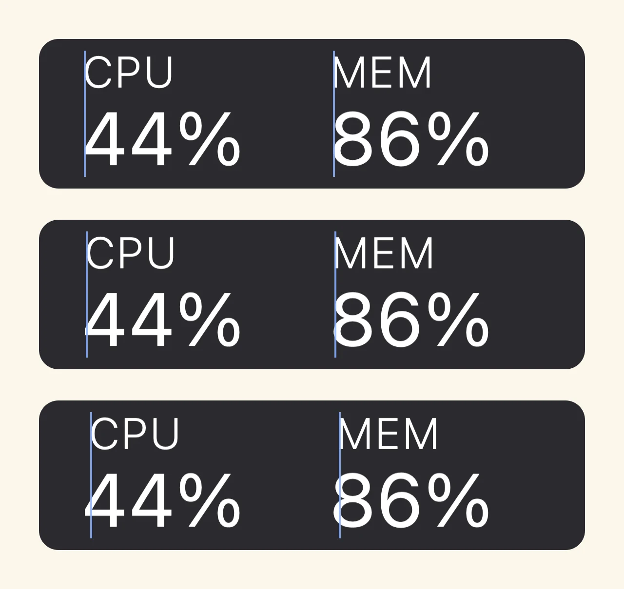
In the old cells the label was centered above the number, and it read like a caption floating over it. This time both the label and the value are left-aligned and drawn from the same x coordinate, so they should line up. Zoomed in, the label always sat a little to the left of the number. The cause is in the font: every glyph carries a small built-in margin on its left side. The 12pt tabular digits have 0.7 to 1.0pt of it, the digit 1 has 1.7pt, and the capitals in a 7pt label have only 0.3 to 0.6pt. They start at the same point, yet the visible strokes end up 1 to 3 pixels apart, most visibly when a reading starts with 1.
On the left, both are drawn from the same point and the 1 sits to the right of the C. On the right, the label moves onto the digit's stroke and the edges line up.
The fix moves the label onto the first stroke of the value and leaves the value alone. The reading changes every second, and if it shifted whenever its first digit changed, the number you are watching would wobble from side to side. Moving the small label above it avoids that; it only moves, by less than 1pt, when the reading crosses into another tens digit.
Even with the strokes exactly aligned, the value still looked slightly to the right. That is a common illusion when a large figure sits under small text: a 12pt round digit is much bigger than a 7pt light caption, and the eye reads the edge of the bigger glyph as further in. I compared 0, 0.5 and 1pt. At 1pt the number already looked like it was pushing out, so the value now hangs 0.3pt to the left, a little over half a pixel, which is just enough for the two lines to look like they stand on the same edge.
The blue lines mark the left edge of each label. From top to bottom: exactly aligned, the value hanging 0.3pt to the left, and 1pt. The middle one is what shipped.
## Reserve the width of every number
When anything in the menu bar changes width, every icon to its right moves with it, so each kind of reading needs room reserved for its widest form. Two gaps turned up. Fan speed is written `850` below 1000 rpm and `2.1k` above it, and the two forms reserved different widths, so the whole menu bar jumped when the fan crossed 1000 rpm. Swap used the system's byte format directly, which produced `10.52 GB`, or `1,2 Go` on a French system: too long for a 12pt cell, and its width changed with the reading. Both fan forms now share one width, and swap in the menu bar is always a short form of at most three digits such as `512 MB`, `1.2 GB` or `12 GB`. The full value stays in the popover.
Network speed got one fix along the way. Below 10 KB/s it used to show one decimal place, so an idle `0.0 KB/s` sat above `86 KB/s` with a decimal point in one line and not the other, and the right-aligned pair never looked even. A tenth of a kilobyte per second tells you very little, so KB/s is now always a whole number. MB/s keeps one decimal below 10, where the difference between `1.5 MB/s` and `1 MB/s` actually matters.
## How to set it up
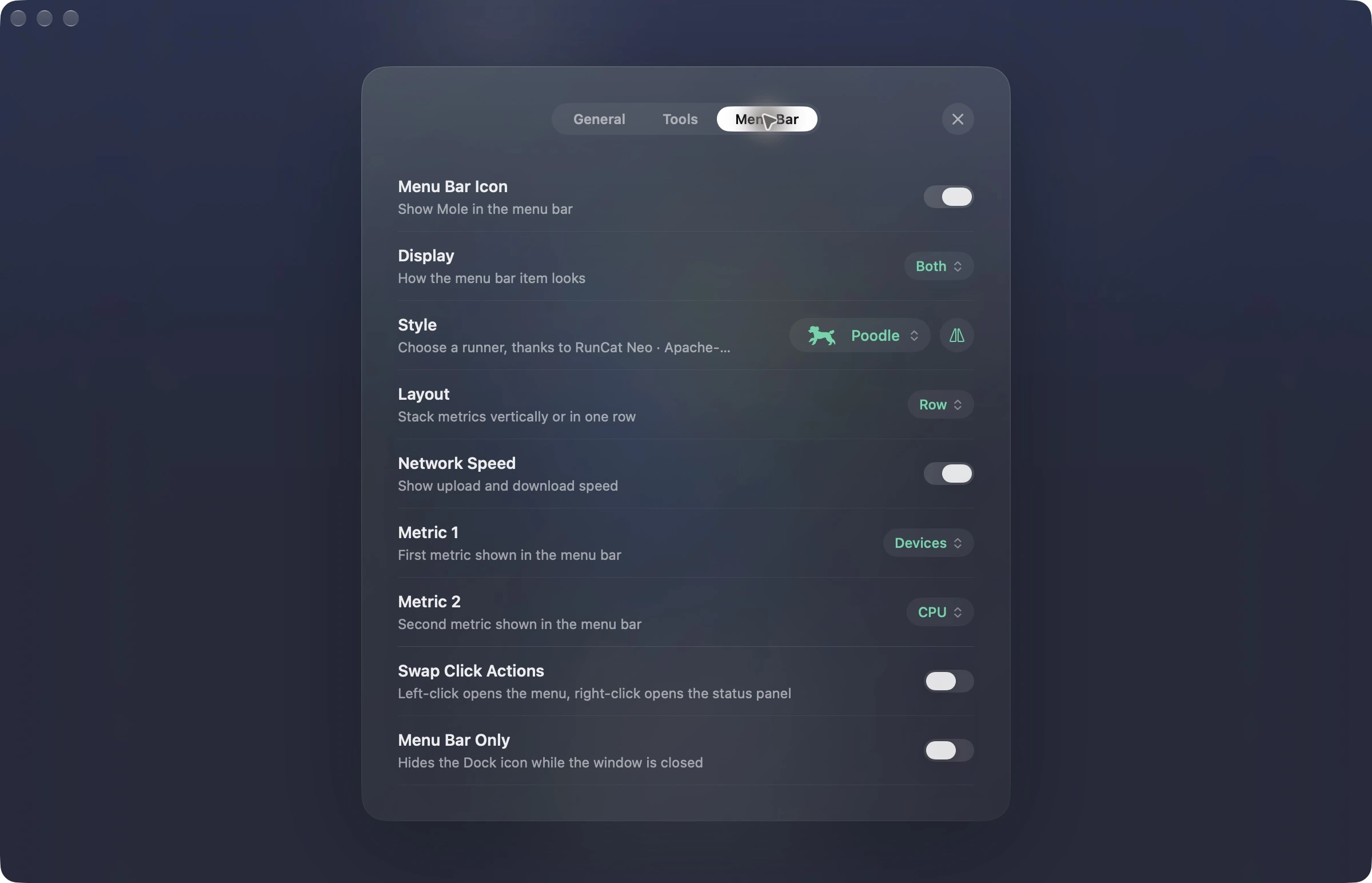
In Mole's Settings, open the Menu Bar tab. The Display row has three options: Runner shows only the mole, Metrics shows only the numbers, and Both shows the mole with numbers beside it, so pick Metrics or Both to see the numbers from this post. A few more rows then appear below. Layout set to Row gives the label-over-value cells, and Stacked gives the two lines of small text. Metric 1 and Metric 2 choose the two metrics, CPU and memory by default, and you can switch either one to GPU, temperature, power, fan, swap or the battery of a Bluetooth device. Turning on Network Speed adds upload and download on the right. The mole itself can be swapped for another character under Style, and the button next to it turns the character around.
People sometimes ask why the mole is running so fast. Its pace is the CPU reading: the busier the Mac, the faster it runs. It follows whichever is higher, overall CPU usage or the one-minute load average. Fully idle it takes a step about every 1.3 seconds, and from 70% it stops speeding up at roughly four steps a second. The curve climbs faster at low load so that 10% and 30% look clearly different, which means that with a browser open and some writing going on it already runs about twice as fast as when the Mac is idle, and compiling code or exporting video makes it really run. The pace is a deliberate signal, which is why there is no separate speed setting. Other characters move at their own pace, because each one has a different number of animation frames. When only the mole is shown, hovering over it shows the same hint: "Runs faster when the CPU is busier".
The Menu Bar tab in Settings, where the display mode, character, layout and metrics are all set.
## What I tried and kept as it was
At one point the temperature cell looked too large to me. I made one version with the unit at 9pt and another at 10pt, and in both the smaller `°` dropped toward the baseline, so `58°C` read like the typo `58°c`, and the percent sign became noticeably smaller than the one Stats shows right next to it. Measuring again showed the number was exactly the same size as the CPU cell; it only looked bigger because `58°C` has one more capital letter than `44%`. So the size stayed as it was.
There was also an old rule that only the two-line layout could appear beside the character, never these label-over-value cells. The version that rule was written against used 12pt semibold. With the bold gone, the reason no longer applies, so both layouts can now appear beside the character, and cells are the default.
In order: the character with metrics, with network speed added, the two-line layout, metrics only, fan and swap, and full load. None of them run together.
Looking back, none of these changes is big. They are half pixels, one decimal point and a few points of spacing, and together they decide whether an icon blends into the menu bar or jumps out of it. If you build a menu bar app, put your item and a few popular neighbours in one screenshot and compare them, measure the ink rather than the box, and reserve the widest width of every reading. After those three, it will probably not look out of place.
All of these values are now covered by tests, one each for weight, width and label alignment, so a later change is less likely to undo them. It is the same idea as [Designing Mole to Stay Out of the Way](https://mole.fit/blog/the-design-of-mole): what lives in the menu bar is best when you look at it every day and never notice it.
---
Canonical HTML page: https://mole.fit/blog/mole-menu-bar-redesign
Blog index for agents: https://mole.fit/blog/llms.txt
Site index for agents: https://mole.fit/llms.txt